Why Neutrals Feel Like a Deep Breath for Your Home
I still remember the moment I walked into a friend’s living room after she’d repainted the walls soft cream and replaced vibrant cushions with beige linen covers. The air felt lighter. Sounds softened. The room — once chaotic and overstimulating — exhaled. That calm sweep across the room wasn’t magic; it was the quiet power of a neutral palette home decor.
Neutral tones don’t scream for attention. They whisper. They give your space room to breathe, let your eyes rest, and invite subtle textures, gentle light, and soft shadows to tell the story. Over 15 years working in interior styling — from cramped city flats to spacious homes — I’ve seen how neutrals can transform a house into a sanctuary: calm, cohesive, and timeless.
In this article, I’ll guide you through how and why neutral-palette decorating works — and how you can create your own soft, calm, Pinterest-perfect interiors.
What Is a Neutral Palette — And Why It Works So Well
The Essence of Neutral Colors
“Neutral” doesn’t just mean “white.” A neutral palette spans a wide family of soft, desaturated, low-saturation tones — whites, creams, beiges, taupes, greiges, soft browns, muted charcoal or greys, off-whites.
These gentle tones don’t compete with each other. Instead, they create a harmonious backdrop — a calming canvas where furniture, light, textures, and décor details can shine. That makes neutral palettes extremely versatile and timeless.
The Benefits: Calm, Flexibility, Timelessness
- Visual calm & mental ease: Neutral interiors relax the eyes and the mind. Without bold patterns or harsh contrasts, spaces feel restful — ideal after a long day.
- Flexibility to change décor easily: Because the base is subtle and non-committal, you can swap pillows, throw blankets, artwork, or accent pieces — maybe seasonally — without worrying about colors clashing.
- Timeless, enduring look: Trends come and go. But neutral-based interiors remain elegant and fresh over time. Whether you go for minimalism, Scandinavian, modern, or cozy-contemporary — neutrals adapt.
- Easy coordination and cohesion throughout home — walls, furniture, textiles, accessories all stay in harmony without overthinking.
How to Build a Neutral-Palette Interior: Principles & Steps
Here’s an expert yet friendly roadmap that I follow (and often recommend to clients) when designing a neutral-based home.
Principle 1: Choose Your Base Tones — Be Intentional with Undertones
Not all neutrals are created equal. Some lean warm (beige, greige, creamy off-white), some cool (soft grey, taupe). The key is undertone harmony. Mixing cool-toned neutrals with warm-toned ones can sometimes create an uneasy, disjointed feel. Interior-design experts call this the “hidden-hue rule.”
My tip: Pick a base family (warm-neutral or cool-neutral) based on your space’s light — natural, warm light works beautifully with warm neutrals; north-facing or cooler-light rooms may benefit from cooler neutrals.
Principle 2: Layer Textures, Not Just Colors
Because neutrals are subtle, texture becomes your greatest friend. Use a mix of materials: soft linen curtains, wool or jute rugs, woven baskets, wooden furniture, ceramic vases, linen throws — textures give depth and tactile comfort.
Principle 3: Let Light Play Its Role — Use Natural Light & Soft Artificial Light
Neutrals respond beautifully to light. During the day — natural sunlight bouncing off off-white or beige walls makes the space feel open and airy. At night — soft lamps or warm LEDs add cozy depth without overwhelming the calm.
When I design interiors, I often ask: “Where does the sun hit? Where will the reading nook be? Where will evening light fall?” — then place furniture and lighting accordingly to enhance softness and mood.
Principle 4: Use Minimal but Thoughtful Accents — Keep the Look Clean & Intentional
Neutral doesn’t mean boring. Thoughtful, minimal accents — a soft throw blanket, a potted plant, a ceramic vase, a textured pillow — add soul without clutter. Even metallics (brass, brushed gold, muted silver) work beautifully as subtle highlights.
Principle 5: Consistency Across Spaces — Create Harmony from Room to Room
Using the same neutral base — or harmonious undertones — across multiple rooms (living room, bedroom, kitchen) creates flow and coherence. Your home feels like “one whole” rather than disjointed rooms. This cohesion also makes décor swaps easier in future.
Neutral-Palette Style Variations (Soft, Calm vs Minimalist vs Warm & Cozy)
Depending on your taste and lifestyle, you can tailor the neutral-palette approach to different moods. Here are three variations I often recommend:
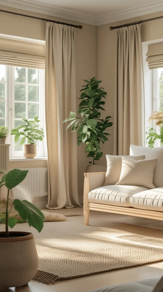
Serene & Airy “Scandinavian-Light”
- Base: off-white, light grey, pale beige
- Furniture: light wood (ash, birch), simple lines
- Textiles: linen curtains, wool rugs, minimal patterns
- Accents: greenery (plants), white ceramics, soft cushions
This style feels crisp, calm, and very relaxing — ideal for small apartments or spaces with lots of natural light.
Warm & Textured “Cozy Neutral”
- Base: warm beige, greige, soft taupe
- Furniture: medium wood tones, woven or rattan pieces, soft upholstery
- Textiles: jute/rug, knitted throws, wool or cotton cushions
- Accents: muted metallics (bronze, brushed gold), earthen ceramics, potted plants
This version has warmth, earthiness, and comfort — perfect for those who want a gentle, inviting home without loud colors.
Elegant Minimalist “Modern Neutral”
- Base: cool greys, charcoal, soft white, black accents
- Furniture: sleek lines, minimal design, mix of materials (metal, glass, concrete)
- Textures: velvet or boucle upholstery, simple rugs, minimal decor
- Accents: black-metal frames, monochrome art, minimal greenery
This suits modern loft-style apartments or anyone who loves a chic, understated aesthetic.
Common Mistakes & How to Avoid Them (Lessons from Real Projects)
Over years of designing homes, I’ve seen certain pitfalls when people try neutral décor — and how to avoid them.
Mistake: Using Neutral Colors Without Texture — The “Flat & Sterile” Trap
If you go all white or grey with no variation — no rugs, no wood, no fabric — the space may feel cold, empty, or clinical.
Fix: Always combine neutrals with texture + layers. Cozy rug + wooden furniture + soft textiles + plants will instantly add personality and warmth.
Mistake: Mixing Incongruent Undertones — Visual Clash
Some homeowners mix a cool grey floor with warm beige walls and warm-toned furniture without thinking. The result: disjointed space where nothing feels cohesive.
Fix: Identify undertones first. Stick to warm neutrals together or cool neutrals together. Use sample swatches and view in different lights before committing.
Mistake: Over-decorating with “Accents” — Losing Calm
Because neutrals are subtle, sometimes people overcompensate with too many accents (bright cushions, multiple art pieces, random décor). That kills the calm and simplicity.
Fix: Be selective. Use few but meaningful accent pieces. Let empty space have value.
Quick Checklist: How to Start Your Neutral Palette Makeover
| ✔︎ | Step | What to do / think about |
|---|---|---|
| 1 | Choose base tones | Decide whether you want warm-neutral or cool-neutral undertones |
| 2 | Clear & simplify | Remove excess décor, over-decorated items |
| 3 | Layer textures | Add rugs, soft textiles, wood, natural materials |
| 4 | Introduce soft lighting & natural light | Use lamps, curtains, maximize daylight |
| 5 | Add minimal, meaningful accents | Plants, ceramics, subtle décor pieces |
| 6 | Maintain cohesion | Carry the same neutral rhythm across rooms |
| 7 | Resist clutter creep | Use the “less is more” mindset — bring in pieces intentionally |
FAQs — Common Questions About Neutral Palette Home Decor
Q1: Will neutral décor make my home look bland or boring?
A: Not if you do it right. Neutrals are a canvas — texture, lighting, shape, and light vs shadow bring character. With thoughtful layers and intentional accents, neutral homes can feel calming, elegant, and deeply personal.
Q2: How to mix neutrals without the space looking washed-out?
A: Mix different shades (off-white, taupe, greige, light brown) with varied textures (wood, linen, wool, woven fabrics). Use contrast — for instance, a darker neutral sofa with light-toned walls. Light and shadow also add depth.
Q3: Can I add a pop of color? Or should I avoid it?
A: Yes — a neutral base gives freedom to add pops of color or pattern without overwhelming the room. Think an accent pillow, a piece of art, a houseplant, or a decorative bowl — easily swappable as your mood changes.
Q4: Is neutral décor suitable for small apartments or large houses?
A: Absolutely. Neutrals adapt to any scale. In small spaces, they make rooms feel larger and airy. In large homes, they bring cohesion and calm across multiple rooms.
Q5: How to maintain a neutral home without it becoming dusty or dull over time?
A: Keep a simple maintenance routine: regular cleaning of light fabrics, dusting, cleaning floors. Rotate textiles (throws, rugs). Occasionally refresh with new accent pieces or a different arrangement to keep the space feeling alive.
Conclusion — Embrace Neutrals and Let Your Home Breathe
Neutral palette home decor isn’t about erasing personality or striving for Instagram-perfection. It’s about creating calm, timeless, flexible spaces where you feel grounded, relaxed — a home that feels like a gentle exhale.
When you layer texture, let light play, and choose purposeful accents, neutrals don’t disappear. They sing softly. They lift moods, quiet the mind, and make your home feel like a refuge.
If you’ve ever felt overwhelmed by chaos — excess colors, mismatched furniture, visual clutter — start simple. Pick one room, choose a neutral base, add texture, light, and meaningful accents. Watch as the calm settles in.
Because in a world full of noise and distractions — a home in soft, calm neutrals can feel like a gentle, soothing whisper.
Happy styling. 🌿